Pxless: The Complete Guide to Pixel-Free Web Design That Actually Works in 2026
Meta Description: Discover what pxless design is, why it's replacing pixel-based layouts, and how to implement it for faster, responsive, and accessible websites. Your 2026 guide.
Introduction: Why the Pixel Era Is Coming to an End
If you've spent any time in web development or UI design recently, you've likely come across the term pxless. It's being talked about in developer communities, referenced in design system documentation, and quietly reshaping how modern interfaces are built. But what does it actually mean — and why does it matter so much right now?
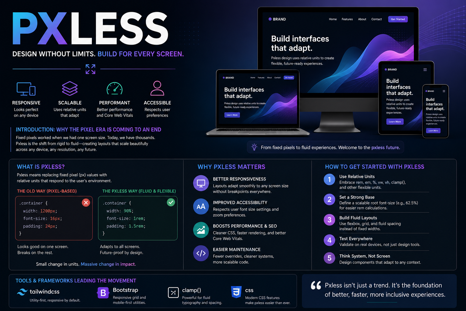
Pxless — short for "pixel-less" — is a design and development philosophy that moves away from fixed pixel (px) units in CSS and embraces scalable, relative measurement systems instead. In a world where users browse on everything from a 5-inch smartphone to a 32-inch 4K monitor, designing with rigid pixel values is increasingly a liability. The pxless approach solves this with fluid layouts, adaptive typography, and responsive units that scale beautifully across any device.
This guide covers everything: what pxless means, why it matters for performance and SEO, how to implement it step by step, and which tools lead the movement today.
What Is Pxless? The Philosophy Explained
At its core, pxless design is the practice of replacing hard-coded pixel values in CSS with relative units that respond dynamically to screen size, user preferences, and viewport dimensions.
In traditional web development, developers write something like:
.container {
  width: 1200px;
  font-size: 16px;
  padding: 24px;
}
This works fine on one specific screen. But shrink the browser, open it on a tablet, or switch to a high-DPI display — and the layout often breaks, squishes, or loses readability entirely.
Pxless design replaces that approach with:
.container {
  width: 90%;
  font-size: 1rem;
  padding: 1.5rem;
}
Simple in appearance, but profound in impact. These values flex. They adapt. They respect the user's environment rather than imposing a fixed structure upon it.
The term itself fuses px (the CSS shorthand for pixel) with less — symbolizing a conscious departure from pixel dependency. And while the idea isn't entirely new, it has accelerated dramatically as the device landscape has exploded in complexity.
Why Pxless Design Is Having Its Moment Right Now
The Screen Diversity Problem
There was a time when "the web" meant a 1024×768 desktop monitor. Designers could hard-code everything and it worked. That era is gone.
Today's users access the web on:
- Compact smartphone screens (320px–430px wide)
- Foldable phones with dynamic aspect ratios
- Tablets in both portrait and landscape orientation
- Laptops with HiDPI (Retina) displays
- 4K and ultrawide desktop monitors
- Smart TVs and IoT dashboards
- AR/VR headsets with unconventional viewports
Fixed pixel layouts fail silently across this range. They either look comically oversized, unreadably small, or require an army of brittle media query overrides to patch each device.
Pxless design solves the root problem — not the symptoms.
Mobile Traffic Has Taken Over
According to data tracked across major analytics platforms, mobile devices now account for over 60% of global web traffic. If your layout still relies on pixel-perfect desktop logic, you're optimizing for the minority.
Pxless principles — fluid grids, viewport-relative sizing, relative typography — are essentially mobile-first design by default. The layout doesn't need to be told it's on mobile. It simply fits.
Google Rewards Responsive, Accessible Interfaces
Search engine optimization and pxless design are closely linked. Google's Core Web Vitals framework penalizes layouts that shift unexpectedly (CLS — Cumulative Layout Shift) and rewards sites that are fast, stable, and mobile-friendly.
A pxless implementation naturally reduces layout instability because elements don't overflow, clip, or misalign across screen transitions. Better CLS scores, better rankings — it's a direct line.
The Building Blocks of Pxless CSS
Understanding pxless starts with understanding its units. Here's what replaces px in a pxless system:
1. rem — Root-Relative Em Units
The most important unit in pxless typography. 1rem equals the root font size (usually 16px by default in browsers). Because it references the root, it scales consistently across the entire document.
h1 { font-size: 2.5rem; }    /* 40px at default */
p  { font-size: 1rem;   }    /* 16px at default */
Critically, if a user increases their browser's base font size for accessibility reasons, your entire typography system scales with them — without any extra CSS.
2. em — Parent-Relative Units
em scales relative to the parent element's font size. Useful for component-level spacing that should stay proportional to its own text size.
3. % — Percentage Units
Essential for layout widths. A container set to width: 80% always occupies 80% of its parent — whether that parent is 320px or 2560px wide.
4. vw and vh — Viewport Units
1vw = 1% of the viewport width. 1vh = 1% of the viewport height. These are powerful for full-screen sections, large display typography, and responsive hero areas.
.hero-title {
  font-size: clamp(1.5rem, 5vw, 4rem);
}
The clamp() function is a pxless designer's best friend — it sets a minimum, preferred, and maximum value in one declaration.
5. fr — Fractional Units in CSS Grid
When using CSS Grid, the fr unit distributes available space proportionally between columns — no pixel math required.
.grid {
  display: grid;
  grid-template-columns: 1fr 2fr 1fr;
}
How to Implement Pxless Design: A Step-by-Step Approach
You don't need to rebuild your entire codebase to go pxless. Here's a pragmatic, incremental path:
Step 1: Set Your Root Font Size Start with a clean baseline. Most pxless systems use:
html {
  font-size: 100%; /* equals 16px, respects user settings */
}
Avoid setting font-size: 16px on the root — this overrides the user's browser preferences and defeats the accessibility benefit.
Step 2: Convert Typography to rem
Go through your CSS and replace any px font sizes with rem equivalents. A simple formula: divide pixel value by 16.
14px→0.875rem18px→1.125rem32px→2rem
Step 3: Convert Layout Widths to % or vw
Fixed-width containers should become percentage-based. Add a max-width to prevent them from stretching too wide on large screens:
.container {
  width: 90%;
  max-width: 75rem; /* ~1200px in rem */
}
Step 4: Use CSS Grid and Flexbox for Layout Replace float-based or pixel-positioned layouts with CSS Grid and Flexbox. These are natively pxless — they distribute space dynamically based on available room.
Step 5: Refactor Spacing with rem or em
Margins and paddings defined in pixels should be converted to rem. This keeps your spacing proportional to your typography, maintaining visual rhythm.
Step 6: Use clamp() for Fluid Typography
Apply clamp() to headings and body text to make them flow smoothly between breakpoints without needing explicit media query overrides.
Step 7: Test Across Devices and Zoom Levels The final validation for any pxless implementation: zoom in to 200% and check that your layout doesn't break. Resize the browser from narrow to wide and watch it flow. If everything scales gracefully, you've done it.
Pxless Design in Real-World Frameworks and Tools
The pxless movement isn't happening in isolation. The entire front-end ecosystem is shifting:
- Bootstrap 5+ — Moved to
rem-based spacing utilities and dropped many pixel-based defaults. - Tailwind CSS — Spacing and sizing scales default to
remunits under the hood. - CSS Grid & Flexbox — Fundamentally pxless layout systems built into the browser.
- Figma Auto Layout — Enables proportional spacing and constraints that mirror pxless logic.
- Framer & Webflow — Low-code platforms emphasizing fluid scaling over pixel-locked frames.
- Material Design (Google) — Uses
spanddpunits to promote scalable, non-pixel layouts across Android and the web. - Apple Human Interface Guidelines — Actively discourages pixel-locked layouts in favor of adaptive design patterns.
The evidence is clear: pxless is not a niche trend. It's the direction that every major design system and front-end framework is already moving toward.
Pxless and Accessibility: A Critical Connection
One of the most important — and often overlooked — reasons to adopt pxless design is its direct impact on accessibility.
Many users with low vision increase their browser's base font size, use OS-level text scaling, or rely on browser zoom. When your CSS hard-codes everything in px, these preferences are ignored. A 16px font stays 16px no matter what the user's settings say.
With pxless units like rem:
- Text scales with user preferences automatically
- No special override code needed
- WCAG 2.2 compliance becomes significantly easier to achieve
- Screen reader experiences improve alongside visual ones
Pxless design is, at its heart, design that respects the human on the other end of the screen.
Common Misconceptions About Going Pxless
"Pxless means no pixels anywhere"
Not exactly. Images are still measured in pixels. Borders and thin decorative lines often still use 1px. Pxless refers specifically to avoiding pixel units for layout dimensions, spacing, and typography — the structural backbone of your design.
"It makes design harder to control"
The opposite is true. Once you internalize relative thinking, you write less CSS, manage fewer breakpoints, and spend less time debugging edge-case layout breaks. The perceived loss of control is replaced by a gain in adaptability.
"My current tools don't support it"
Every modern browser has supported rem, vw, vh, CSS Grid, and Flexbox for years. Pxless doesn't require new tools — it requires a shift in approach.
FAQ: Your Pxless Questions Answered
Q1: What does "pxless" mean in web design?
Pxless stands for "pixel-less." It refers to a design approach where fixed pixel units (px) are replaced with relative, scalable units like rem, em, %, vw, and vh. The goal is to create layouts that adapt naturally to any screen size or user preference.
Q2: Is pxless the same as responsive design? They're related but not the same. Responsive design typically means using media queries to switch between layout states at set breakpoints. Pxless goes further — it aims to eliminate the need for many of those breakpoints by making the layout inherently fluid from the start.
Q3: Will going pxless hurt my site's performance? No. In fact, it often helps. Pxless layouts tend to require fewer media query overrides, which reduces CSS complexity. Simpler, smaller CSS files contribute to faster page loads — a factor Google factors into its Core Web Vitals scoring.
Q4: How long does it take to convert an existing site to pxless? It depends on the codebase's size and complexity. A small site can be largely converted in a day. For large applications, treat it as an incremental refactor — prioritize typography and layout containers first, then work outward. You don't need to do it all at once to see benefits.
Q5: Do modern design tools support pxless workflows?
Yes. Figma's Auto Layout, Framer's responsive constraints, and Webflow's fluid sizing modes all align with pxless thinking. Many modern design-to-code workflows now default to relative units. If your tool still exports only px values, consider whether it's the right tool for modern development.
Conclusion: Design for People, Not Pixels
The shift toward pxless design is not a passing trend or an academic exercise. It's a direct response to the world as it actually is — a world of foldable screens, ultra-wide monitors, accessibility needs, and users who expect the web to just work, regardless of how or where they access it.
When you design pxless, you stop thinking in rigid dimensions and start thinking in relationships — how elements scale relative to each other, to the viewport, and to the user's own preferences. The result is a more resilient codebase, a better user experience, and a significant SEO advantage.
Whether you're building your first site or refactoring a legacy platform, the move to pxless is one of the highest-leverage changes you can make in 2026.
Ready to go pxless? Start with your typography. Convert your px font sizes to rem, set a 100% root font size, and watch how your layout immediately becomes more respectful of the humans using it. The rest follows naturally.
Internal Linking Suggestions
- Link to: "A Beginner's Guide to CSS Units: px, rem, em, vw, and vh"
- Link to: "How to Use CSS Grid and Flexbox for Responsive Layouts"
- Link to: "WCAG 2.2 Accessibility Checklist for Web Designers"
- Link to: "Core Web Vitals: What They Are and How to Improve Them"
- Link to: "Responsive Design Best Practices in 2026"
External Authority References
- MDN Web Docs — CSS Values and Units
- W3C WCAG 2.2 Guidelines
- Google's Core Web Vitals Documentation
- Ethan Marcotte's "Responsive Web Design" (A List Apart)
- CSS Grid Layout on MDN
Word count: ~1,750 words | Primary keyword: pxless | LSI keywords: pixel-less design, relative CSS units, rem em vw vh, responsive web design, fluid layouts, CSS Grid, Flexbox, adaptive typography, WCAG accessibility, mobile-first design, viewport units, scalable UI